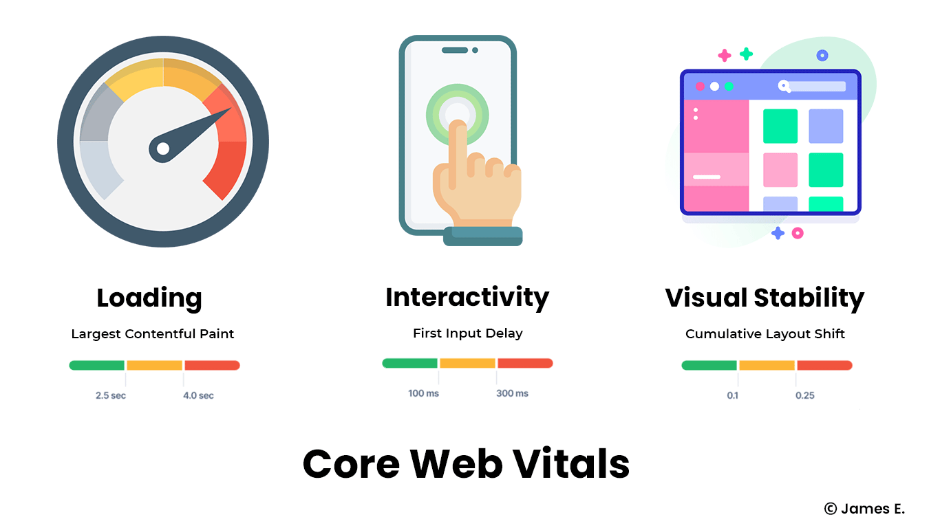
Google's Core Web Vitals program has gripped the SEO and Web Performance communities, and many sites are working to improve their Page Experience to maximize the ranking factor.
User Experience is certainly a priority for Google. That is why one of Google's Page Experience indicators is Cumulative Layout Shift. In this article, we will discuss CLS (Cumulative Layout Shift) as well as ways to improve it.
What is (CLS) Cumulative Layout Shift?
Cumulative Layout Shift (CLS) is a Core Web Vitals metric that measures the sum of all layout shifts that aren’t caused by user interaction. CLS also analyzes the proportion of the viewport affected by layout changes, as well as the movement distance of the elements that were moved.
Does your CLS score have an impact on your SEO rank?
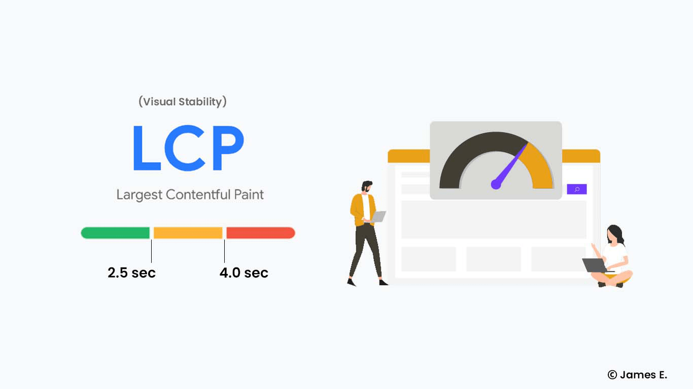
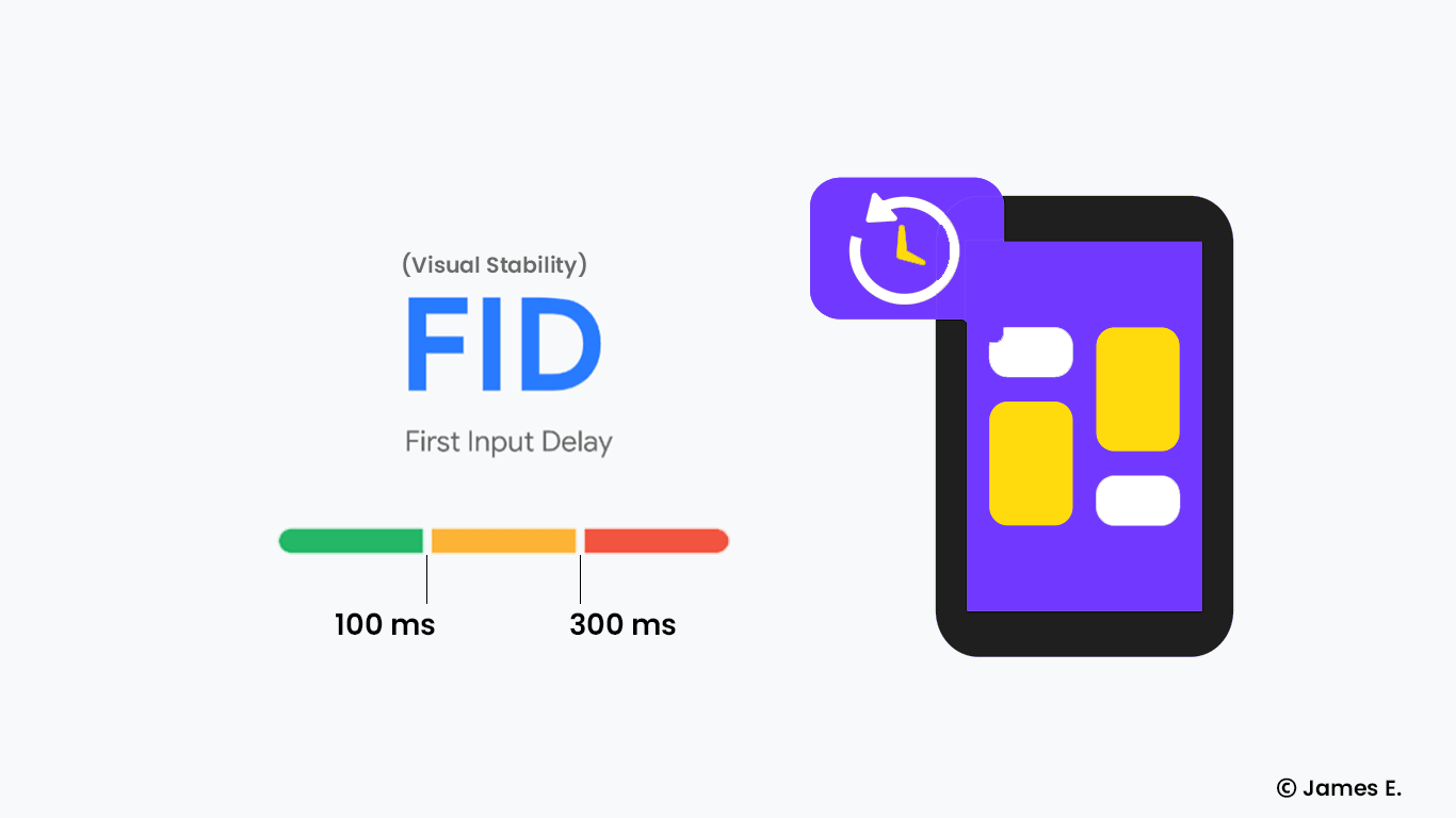
Following Google's Page Experience Update in June 2021, CLS will become a ranking factor. As a result, your CLS score (together with the LCP and FID metrics) will have an impact on your SEO.
How CLS is calculated?
CLS is based on two factors: impact fraction and distance fraction.
impact fraction:
To calculate the impact fraction, you must first determine the impact region.
Impact region refers to the area affected by the layout shift. Google identifies all affected elements and defines the effect region by combining the original area with the shifted version.
The impact region is normally a rectangle, but it might be a more complicated form if there are many layout alterations — both horizontally and vertically.
Let us now discuss the impact fraction.
To get the impact fraction, Divide the area of the impact region by the area of the viewport (the portion of the page visible on the screen without scrolling down).
Impact fraction = area of impact region / area of viewport
The impact fraction was the only component of Google's first version of CLS.
However, big elements may only move slightly, and large movements are more distracting than small ones. With that in mind, the CLS calculation needed to be improved.
As a result, Google devised the concept of distance fraction.
distance fraction:
Before you can calculate the distance fraction, the move distance must be calculated.
Move distance refers to the distance before and after a layout shift. It essentially answers the question of how far the shifted element moved.
To calculate the distance fraction, divide the maximum move distance by the viewport height:
distance fraction = maximum move distance / viewport height
Calculating layout shift
The next step is to calculate layout shift scores.
To get the layout shift score for a single animation frame, multiply the impact fraction by the distance fraction:
Layout shift = impact fraction x distance fraction:
Calculating Cumulative Layout Shift
Original formula
The current formula for calculating your page's CLS score differs from the one proposed by Google in the beginning.
To compute Cumulative Layout Shifts in the past, you would combine the layout shift scores from all animation frames together.
Cumulative Layout Shift = Layout Shift Score 1 + Layout Shift Score 2 +...
However, without a mechanism for hard navigation between specific pages of the program, this strategy proved to be significantly "unfair" to long-lived Single Page Applications.
As a result, Google solicited feedback and attempted to improve the situation.
The formula currently in use
Researchers at Google decided to use a technique to aggregate layout adjustments in session windows.
Session windows are simply time intervals throughout the lifecycle of your website that summarizes layout shifts.
A session window is opened when your page's layout changes. It can last up to 5 seconds, but if no layout shifts occur within 1 second of the preceding shift, it will close sooner.
Session windows are then used to summarize layout shifts. Your CLS score is determined by the maximum score of a single session window; other session windows do not influence your CLS.
To give you an example, consider the following:
The rendering of your page begins.
After 1 second, the layout shifts by 0.1.
Another 0.2 shift happens after 0.5s.
After 2 seconds, there is a 0.25 shift, and the page is closed.
After 2 seconds, the third layout shift occurred, hence it belongs in a separate session window. That’s because one second after the second layout shift, the previous session window closed.
Hence, we add the scores of the two initial layout shifts that happened in the same session window.
Therefore, the final CLS score for your page would be 0.1 + 0.2 = 0.3! The third layout change has no bearing on the final score.
What more should you know about CLS?
Intentional layout changes: This means that after each user interaction with the site, CLS measurement pauses for 500ms. As a result, if the layout change is deliberate and caused by the user, it will not affect your CLS.
Animations and layout shifts: Layout shifts can be caused by animations, however not all of them will affect your CLS score.
CSS transform changes are ignored by Google, thus if your animation employs the transform property, it won't affect your CLS.Generating layout shifts: Layout shifts usually happen when the page is loading, but they can also happen later and affect your CLS score if they happen outside the input exclusion window.
Layout shifts and content above the fold: CLS only keeps track of shifts that are visible to the viewer. If something moves below the fold and the user doesn't notice it, it will not affect CLS.
How to measure Cumulative Layout Shift (CLS)?
CLS can be measured in two ways:
Field data is gathered from real users through (CrUX) Chrome User Experience Report. Variety of tools to measure field data, including:
- Chrome User Experience Report;
- PageSpeed Insights;
- Search Console (Core Web Vitals report).Lab data is gathered in a simulated environment with no interaction from real users. Variety of tools to measure field data, including:
- Chrome DevTools;
- PageSpeed Insights;
- Lighthouse;
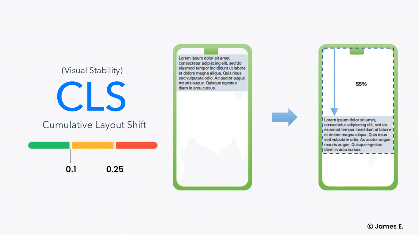
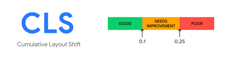
What is a good CLS score?
Source: web.dev
Good: <= 0.1 (0.1 or less).
Needs improvement: > 0.1 <= 0.25 (between 0.1 and 0.25).
Poor: > 0.25 300ms (more than 2.5).
Cumulative Layout Shift (CLS): What Causes It?
According to Google, the following are the most common causes of high CLS:
Images without dimensions,
Ads, embeds, and iframes without dimensions,
Dynamically injected content,
Web fonts causing FOIT/FOUT (Flash of Invisible Text and Flash of Unstyled Text),
Actions waiting for a network response before updating the DOM.
How to improve Cumulative Layout Shift (CLS)?
Encourage the use of font:display values and link rel=preload:
If your site uses online fonts, they could be the source of FOIT (Flashes Of Invisible Text) and FOUT (Flashes Of Output Text) (Flashes Of the Unstyled Text).
The browser frequently displays blank space while downloading fonts from the server until the custom font loads. The layout generally moves quite a bit after downloading and showing the font. It's known as FOIT (Flashes Of the Invisible Text).
Another case is when the browser uses the system font until the custom font is downloaded. That's what we call FOUT (Flashes of The Unstyled Text). Since the system font differs from the custom font, it may take up more or less space. As a result, after your custom font loads, the layout of your site may change significantly.
Use font:display values like auto, swap, block, fallback, or optional to avoid this. For an even better result, preload font files for key fonts using a <link rel=preload> – they will be downloaded as a priority asset.
Include width and height for image and video elements:
Web developers used to embed width and height components everywhere on the site in the early days of the Internet. It appeared as follows:
<img src=”image.jpg” width=”500″ height=”500″ alt=”Example Image”>
When responsive web design took control, this became less popular. Developers began employing CSS to resize images as a result of this new method.
This is great for them, but it's not so great for users affected by CLS.
This strategy allows space only after the browser has begun downloading the image. The layout would shift after all of the images were presented, generating redundant movements.
Aspect ratio is a much better solution for scaling images. It's the width-to-height ratio (e.g. 16:9).
The aspect ratio allows the browser to calculate the amount of space required to display the image, reducing the likelihood of layout shift.
You can utilize the srcset attribute when dealing with responsive images. It lets you put up multiple photo sizes and have the browser display the best one.Wrong implementation of dynamically injected content:
Dynamically injected content should never be displayed above previously loaded stuff. The only time this rule is broken is when a change is brought about through user engagement. As previously stated, such content will not affect CLS if it is loaded within 500ms of the encounter.
If you want to learn more about how to optimize your CLS, Google has a great resource for you.